
"30 Years Later" - Gallery 1988
Hey, it's blog post number three and I'm going to try and step it up this time. I think this one might even have some video clips in it but no promises, I haven't gotten that far yet, obviously this is just the second sentence.
Incase you somehow missed the huge text and image above, this one's all about the to prints I created for Gallery 1988's group show "30 Years Later." If you are unfamiliar with this annual (woof, almost accidentally spelled a word much different then the intended one, there) show, it is a group show collecting art inspired by films that hit theaters 30 years prior. This year was especially important to the gallery as it celebrates the year that gave the gallery their name, 1988. You may be really, really surprised to hear that there was only one movie on the list that I had seen prior to the show invitation. The movie I was familiar with was a favorite as a kid, A Land Before Time and for stylistic reasons, I knew from the start that this wasn't going to be my selection. I will drop the list that was sent below so that you can scorn me for my not having seen a lot of really big classics (yes, I had not seen Beetlejuice before 2017 guys, please leave me alone). Althouhg I may not be able to excuse myself for not having seen these films, I will defend myself in saying that being able to watch these with a fresh mind really gave me a different look at many of these. One of the biggest keys here is that there was an incredible amount of hype attached to so many of these films, setting expectations far to high. Knowing this ahead of time and from past experience especially with cult films, brought me in on a curve which I guess ruins my claim to "coming in fresh" however, this really made one of these films stand out. I was super amused with Beetlejuice and, the fact that this film lived up to it's hype was really quite impressive. This is easily attributed to its complete originality and the simple fact that, at least in my clearly narrow catalogue of viewed movies, there still remains nothing really comparable to it (please prove me wrong and leave my recommendations in the forms below).
So after watching a fair chunk of movies from the list after weening them down based on previews, I decided that Young Guns would be a fun fit for me stylistically. Wood grains and gun fights seemed very appealing, although my final approach took a more deceptively serene and quiet scene.
Along with a handful of sketches for this one, I decided to play with a couple of Beetlejuice doodles, even though I knew I wouldn't end up doing a poster for it (incorrect, you were). I then decided, well I'll keep working both movies until one really stands out to me, deciding to only attack Beetlejuice if I could come up with an approach entirely unique and different from everything else I'd ever seen done for the film.

Oh yes, back to the Beetlejuice concepts and sketches phase... These didn't go far, early on I told myself the only way I would choose this movie for the show was if I could come up with something unlike anything I had seen in Beetlejuice posters before, something so mind blowing and unique that every fan would be amazed. Now, this grand reinvention of the movie in poster form never came to me due to expectations unfairly set by myself (a common mental game I like to play), but really because I fell quickly in love with an image that I hadn't seen illustrated prior. The image comes from the scene where the Maitlands (you know, the dead married couple) are (spoiler alert -->) unsuccessfully attempting to scare the newcomers out of their haunted home and decide that becoming sheet-ghosts will certainly do the trick. To me, this very image really captures the combined silly and creepily off-putting natures of the film. It also avoids showing any of the character likenesses which, for similar reasons to avoiding text, made me feel better on the integrity side of things. The idea of the composition really hit my creative-mark in knowing I would have a super fun time just hatching the shit out of the lighting on the sheets. The idea stuck after coming up with the simple graphic approach to using the black and white stripes from Beetlejuice's prison garb as a subtle hint but bold compositional element. These stripes also enclose the sheet-ghosts in a sort of jail like setting that, to me, spoke towards their entrapment, the base behind the movie's plot.
You'll notice that, in the final drawing, I decided to hatch out the black space of the stripes, but then didn't carry this into the final poster. I hatched the space in with the intension of potentially overprinting the dark purple line-work layer on top of the black but elected not to for two reasons. The first was logistical, it made the most sense in printing, for the black to be printed last allowing it to trap a couple of things as well as be as bold as possible. The second reason was that, although I obviously enjoy the pencil hatching texture from an illustrative standpoint, it would have subtracted quite a bit from the graphic nature of the bold stripes, and then could have erased any connection the viewer could make to the stripes hinting at Beetlejuice's iconic clothing. Now, even sort of knowing this in the back of my head, it was important in the drawing to both give myself a visual on how the image would play out but also simply create a better piece for the physical drawing to stand on its own.
I re-watched the entirety of Young Guns because honestly, I had not followed the storyline too closely the first time, an issue that was my own fault and not the movie's. Just a little ways in, I understood a moment in the movie clearer and helped me understand the storyline 100 percent this time around. That same scene caught my intention, a specific frame really grabbed me. Spoiler alert!!! : The group's boss gets murdered, for political reasons, well they are out literally horsing around. This very moment not only shows the naive nature of the boys but also is the very catalyst and reasoning for their desired revenge, which is the rest of the movie. I wanted to rework this scene compositionally, in what could've appeared as a final scene, the eventual cloud and huge red sky allude to a dramatic momentum growing and a metaphorical storm brewing.
Prior to landing on this concept and image as the final, I had danced with another composition that was dependent on using text, specifically the movie title. Although I loved the simple cleverness of using this back view of Doc's suspenders as the 'Y' and even tried combining with the other concept, I ultimately decided that showing just one of the Regulators would not correctly portray the movie. The crowded composition would also allude to this being the character that killed the dead man in the image. Asside from conceptual and compositional reasoning, I was not at all committed to using text on the poster and in fact was leaning heavily against it. The reason was mostly that, up until this point I’ve avoided riding the line on unlicensed property and so why start now?
So as you can see, the combining of concepts was too much. The biggest issue being that it takes away entirely from the silent and subtle nature of the drastic composition. So, I exercised a little design restraint and created a drawing that was mostly negative space. Now, I did decide later on to hatch some loose texture in the sky, so there wasn't a disconnect in the image, but lets not count that. In order to ground things and also carry my illustrative personality into the print, I tediously drew out every little stone on the bottom of the composition.
This one went, quite literally, Bing, Bang, Boom- There was a thumbnail, then a tighter sketch and on to the final drawing. Though I did fool around with a couple of more complex variations of the stripes, just like the Young Guns print, I elected for a more disciplined compositional approach.
As promised, I'm attempting to get some process video footage into these things from now on, for now they will be unedited clips.
These two prints also happened to be the first couple of projects I got to work on using my new toy (please don't tell the IRS I'm calling it a toy..). After saving slowly to purchase a fancier much more expensive version of a direct drawing tablet/ monitor, I realized that a handful of the artists I've looked up to for years have been using the Yiynova and decided to order one. Without writing a long review of it, I will say that as far as the make and a couple of little things it isn't a Wacom product, but it absolutely does everything I need it to do and was well worth jumping the gun on rather than saving 3-times the amount for the fancier version. It has streamlined the coloring portion of my process and also made it much less frustrating and entirely more enjoyable. I think that these factors are helping me push my work a little bit already, or at least helping me to avoid digging into my small patience vault. I've got an absurdly long clip of utilizing this tool in the detail coloring of the Young Guns art.
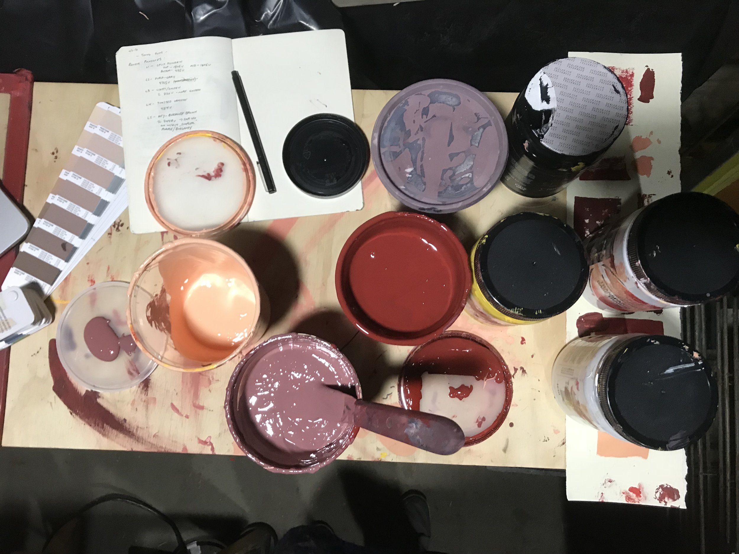
So you probably have successfully skipped reading all of those huge text blocks anyhow, but from here I am just going to place some visuals from the print process. If you have read the previous post then you already know that I am in the midst of rebuilding a new print space here in Denver, so please ignore the DIY dungeon that may appear in some photos- things are still being built and put together but the shop is fully functional as it is right now!


Alright friends, I'm fuckin tired. Thanks for making it through this thing, I hope it was at least a tad interesting and please feel free to shoot me any feedback or questions, or even tell me this is a useless waist of time.. actually please don't do that very last thing. Time for a beer. Also check out the rest of the show and buy some stuff here....... Gallery 1988 - "30 Years Later" - Online Exhibit
Cheers,
Jake & Bernie